Status indicators
Status indicators are an important method of communicating severity level information to users. Different shapes and colors enable users to quickly assess and identify status and respond accordingly.
Overview
An indicator highlights a page element and informs the user of something that needs the user’s attention. Often, the indicator will denote that there has been a change to a particular item. They are frequently used to signal validation errors or notifications, changes, or updates. They can also be used on their own. Indicators are visual cues intended to attract the user’s attention to a piece of content or UI element that is dynamic in nature.
In this pattern we explore:
- Choosing the best status indicators for your context
- The different status indicator variants
- What elements they are comprised of and how each element works to communicate
Choosing for context
In the UI landscape, examples of status indicators are everywhere. However this pattern will focus less on the components or patterns in which indicators tend to appear (notifications, inline errors, dashboards, and so on) and more on the urgency of the communication.
For ease of use, status indicators can be classified into levels of severity such as high, medium, and low attention. See more information on choosing between alias icons and outlined versus filled icons in the Status shapes section below.
Consolidated statuses
When multiple statuses are consolidated, use the highest-attention color to represent the group. For example, if the statuses of underlying components are green, yellow, and red, the consolidated indicator is red.
Cognitive load
Don’t use status indicators when no user action is necessary and status information is not important enough to highlight. Use plain text instead to avoid the overuse of status indicators. While we won’t go as far a prescribing a maximum number, more than 5 or 6 indicators begins to tax a user and makes it difficult to focus.
High attention
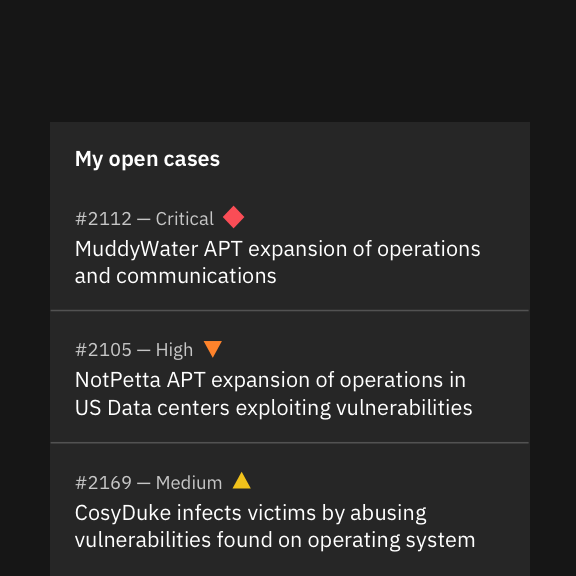
These indicators signal that user action is needed immediately—that is, there is an irregularity in the system, something malfunctioned, or a user needs to confirm a potentially destructive action. Some examples include alerts, exceptions, confirmations, and errors.
Used for: critical situations, emergencies, urgent alerts
Used for: warnings, errors, alerts, failure
Used for: incorrect usage, unavailability, cancellation
Used for: major caution, serious situations, critical instability
Used for: minor caution, prevention, instability
Medium attention
Use these indicators when no immediate user action is required or to provide feedback to a user action. Some examples include acknowledgements and progress indicators.
Used for: experimental work, outliers
Used for: success, completion, stability, active states
Used for: success, completion
Used for: unfinished, running processes
Used for: incomplete tasks
Used for: upstarted tasks or disabled processes
Used for: indefinite holds
Low attention
Use these indicators when something is ready to view, for system feedback, or to signify that something has changed since the last interaction. Some examples include tooltip triggers that offer explanatory or added information, and passive notifications.
Used for: unknown, undefined status
Used for: help, guidance, exceptions
Used for: additional information, exceptions
Ingredients
To communicate their message, indicators can take many forms—they’re not confined to iconography. There are four basic elements that comprise Carbon status indicators. (Note: we won’t get into animation and sound in this pattern.) And for WCAG compliance, at least three of these elements must be present. Let’s look at these elements more closely before examining specific status types.
- Symbols
- Shapes
- Colors
- Type
Status icons
Icons are visual symbols used to represent ideas, objects, or actions. Ideally, they communicate messages at a glance, afford interactivity, and draw attention to important information. For example, using exclamation points for warnings, checkmarks for success, and question marks for help or unknown.
To standardize the icons that are used most widely in IBM product, we’ve included only the most universally recognized icons. Certain products may have certain modifications or most robust sets.
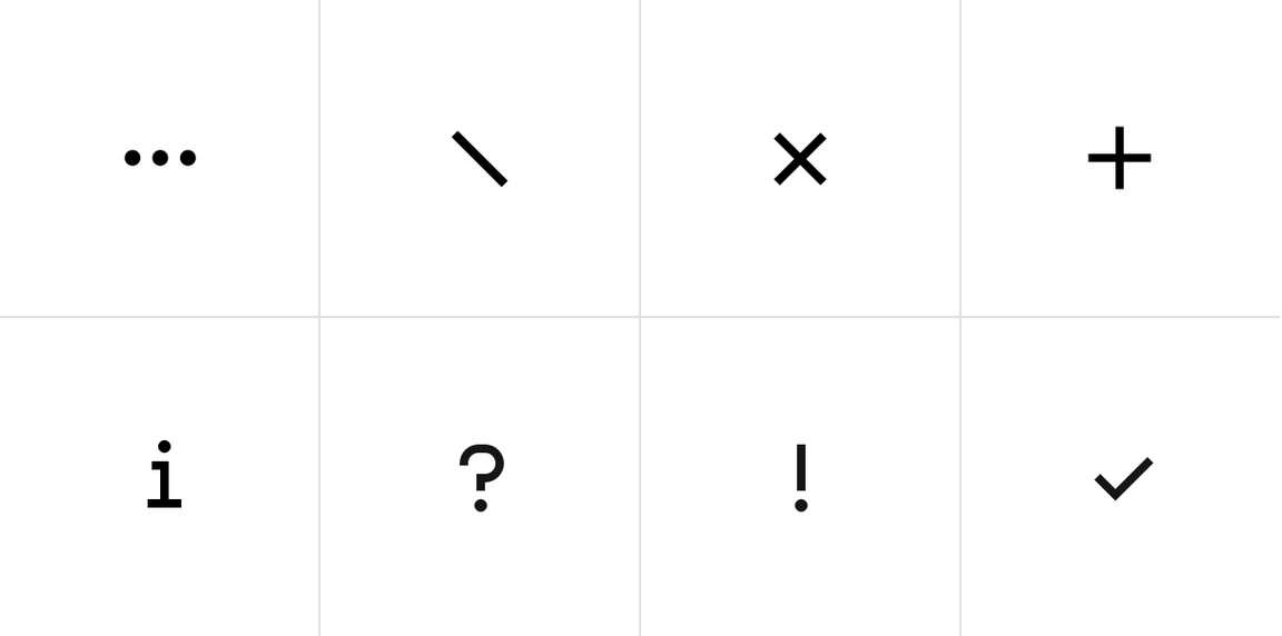
Examples of some of the most common status symbols
Status shapes
In this context, shapes refer to geometric figures like squares, circles, rectangles, and so on, as they are instantly readable even at small sizes. These shapes have strong visual associations that can be applied to help users succeed in using their product flows. For instance, shapes with straight lines and 90 degree angles usually convey structure and order—like the grid. While shapes with curves are friendlier and symbolize continuity and connection.
There can also be cultural associations connected with shapes. For example in traffic and wayfinding, hexagons mean stop, and upside triangles means yield. Using shapes incorrectly can disturb learned recognition patterns and confuse users, possibly hurting their overall experience.
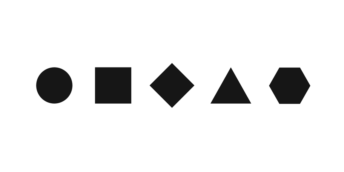
Example of the most common status shapes
Outline versus filled shapes
We offer two options that can be flexible for usage based on your team’s preference. Keep in mind that filled icons are more visible and tend to carry more weight, therefore they’re often used for high attention statuses. Outlined icons are more delicate and not as readily scannable.
In addition, the more line work an icon has—and the more breaks in those lines—the more difficult it is to use a filled icon. For this reason, some product teams may occasionally mix in an outline icon with a filled icon. This is okay but for the most part, designers should try to be consistent throughout the product or application. At the very least, designers should avoid mixing outlined and filled indicators on the same page.
Alias status icons
In several cases, we offer multiple shape options for one type of status indicator. For example, ‘warning’ ‘help’ and ‘information’ status icons have multiple variants to convey similar or exactly the same information. Often times, users of certain products have grown accustomed to say, a hexagon instead of a circle to convey a critical warning. Or a team perhaps wants to go the extra mile and offer yet another differentiator for accessibility. Although consistency is always the goal, there’s no need to avoid differentiation to accomodate user preferences. Whichever style you choose however, avoid mixing throughout the UI.
If an alias that your product frequently uses has been removed from the set and you can make a case for the importance of including it here, please let us know.
Status palette
The status palette includes all of the colors that can be used to reflect status. Typically, red represents danger or error, orange represents a serious warning, yellow represents a regular warning, green represents normal or success, and blue represents passive notifications, usually involving additional information and workflow progress. We’ve also included gray and purple to add more depth to the system. Gray indicates drafts or jobs that haven’t been started, and purple indicates outliers or undefined statuses.
Extended status palettes
This palette is only for added contrast accessibility when using yellows and oranges. It’s not a part of the IBM brand palette and it’s also not included in the v2 color release (that is, it’s not in ASE, Sketch kit palettes, and so on) because it’s for very selective use in data visualizations and certain status indicators. Do not use this palette in any other manner in your layouts.
Variants
There are at least four possible ways to implement status indicators:
- Icon indicators
- Badge indicators (with and without numbers)
- Shape indicators
- Differential indicators
| Variant | Usage | Context |
|---|---|---|
| Icon indicators | Used any time the layout offers ample space and the content requires maximum attention. They require an icon, a shape, a meaningful color and a descriptive inline label. | Icon indicators are widely used in Notifications, Progress indicators, Data tables, task lists and dashboard widgets. |
| Badge indicators (with number) | Useful when a count of new or updated items is available, and it is important for the user to know the number of updates. | Most often used in notification panes in the header, and used in conjunction with avatars or icons. |
| Badge indicators (without number) | Useful when new or updated items are available and the number of notifications is unknown or irrelevant to the user. The dot badge is also more compact and discrete. | Most often used in notification panes in the header, and used in conjuntion with avatars or icons. |
| Shape indicators | Useful in smaller spaces or when users need to scan large amount of data. | Most often used in lists, dashboards, data tables, data visualizations, and network diagrams. |
| Differential indicators | Useful when users are monitoring differentials in large lists of statistics and when anything other than type would be too obtrusive. | Most often used in financial dashboards for highlighting deltas or other types of data visualizations. |
Anatomy
Like a button, a status indicator’s text label is the most important element, as it communicates progress. By default, Carbon uses sentence case for all button labels.
Text labels, column labels (or a legend, when inline labels aren’t an option) are strongly recommended.
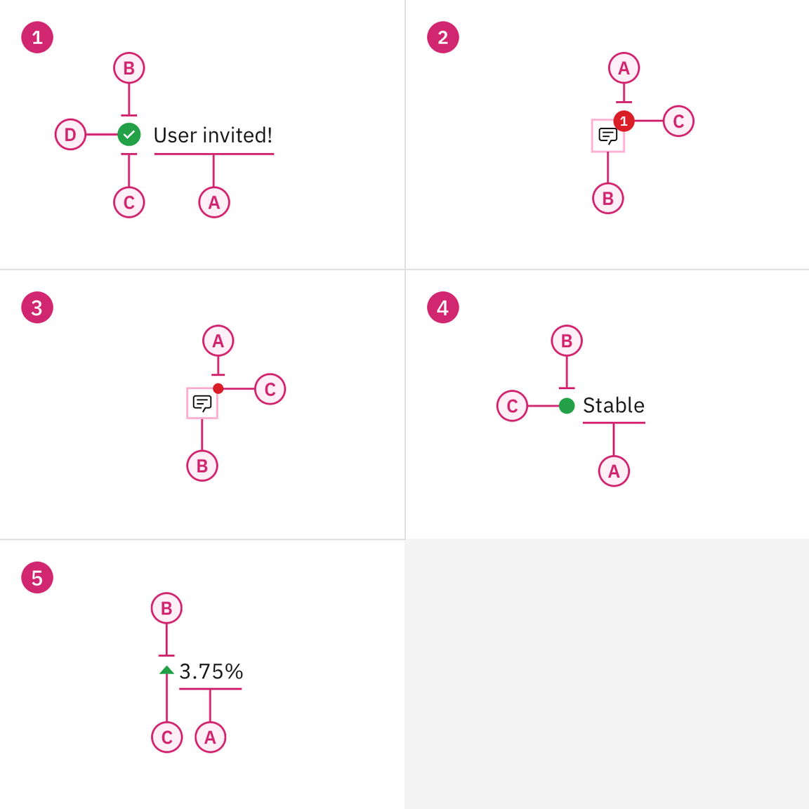
1. Icon indicator
A. Text label
B. Symbol
C. Shape
D. Color
3. Badge indicator (no number)
A. Shape without number
B. Symbol
C. Color
5. Differential indicator
A. Text label
B. Symbol*
C. Color (optional)
2. Badge indicator (number)
A. Shape with number
B. Icon
C. Color
4. Shape indicator
A. Text label
B. Shape
C. Color
*Differential indicators must have either a ‘+’ or ‘-’ sign, a caret, or an arrow icon to indicate positive or negative values.
Formatting
Icon indicators
Icon indicators require an icon, a shape, a meaningful color, and a descriptive label. Easily recognizable icons can make very effective communication tools and greatly improve scannability, especially with large amounts of content. Icon indicators are widely used in notifications, progress indicators, data tables, task lists and dashboard widgets.
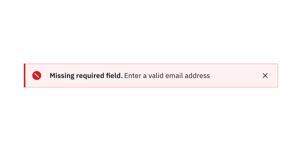
Notifications are the most prevalent example of this type of status indicator.
Type pairing and alignment
Icon indicators are sometimes referred to as ‘contextual’ status indicators as well because they are associated with a UI element or with a piece of content. As such they should be shown in close proximity to that element.
There are also cases, especially in data tables and lists, where the column heading or row label may provide context that is additive to the inline label. When very common ‘stop light’ associations are present, as in the following example, it may not be necessary to explicitly label an icon as ‘warning,’ or ‘stable’ — as these interpretations are widely understood in product. However it is good practice to clarify the status intention in the text label.
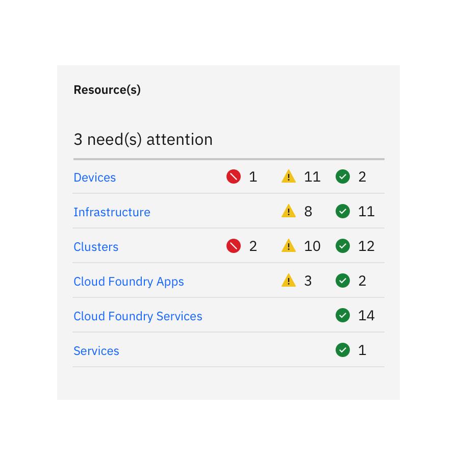
Do left align icons and type in lists and data tables, regardless of whether you’re using the responsive grid or spacers.
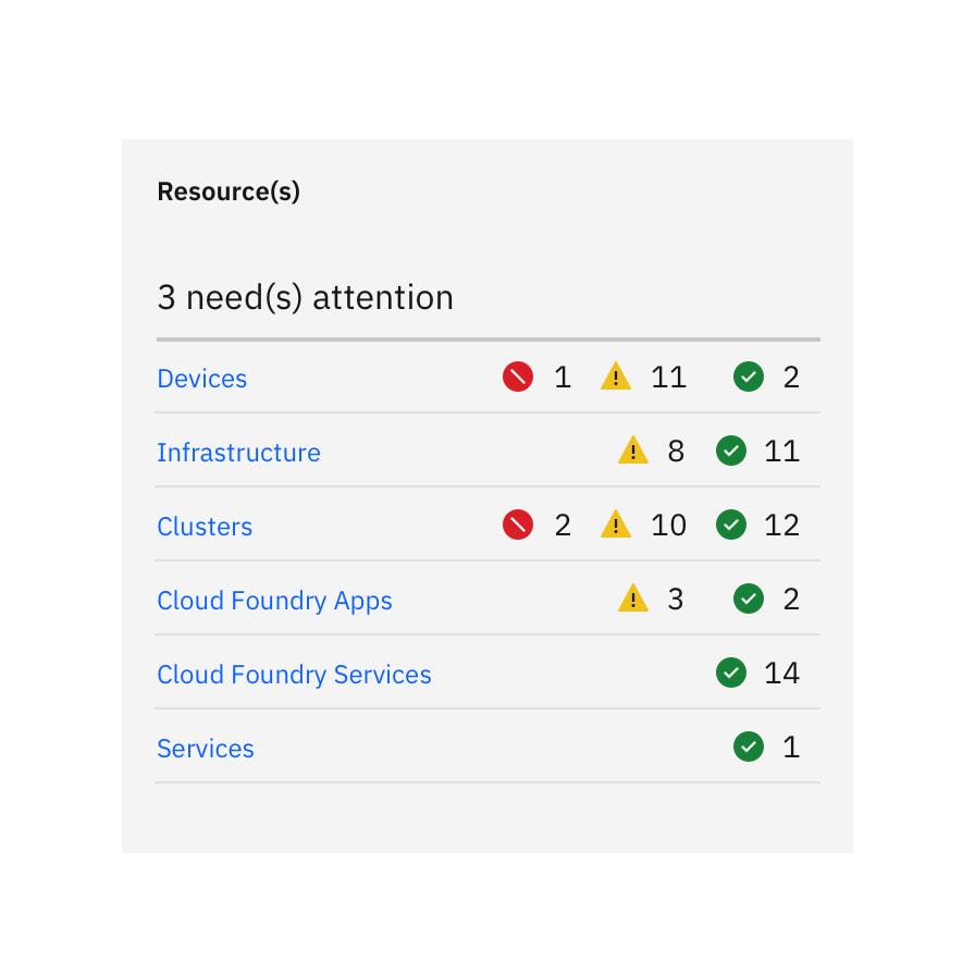
Do not push icons out of alignment with label length. In this case, where the status indicators are flush right, the two digit labels are pushing the icons out of alignment.
Badge indicators
Badge indicators let the user know that something is new or updated. A badge status is displayed over a ghost icon button, usually in the header, to indicate an active notification and is cleared after the user acknowledges the notification. Depending on your use case, the icon button can open a new page or launch a modal, pane, or flyout.
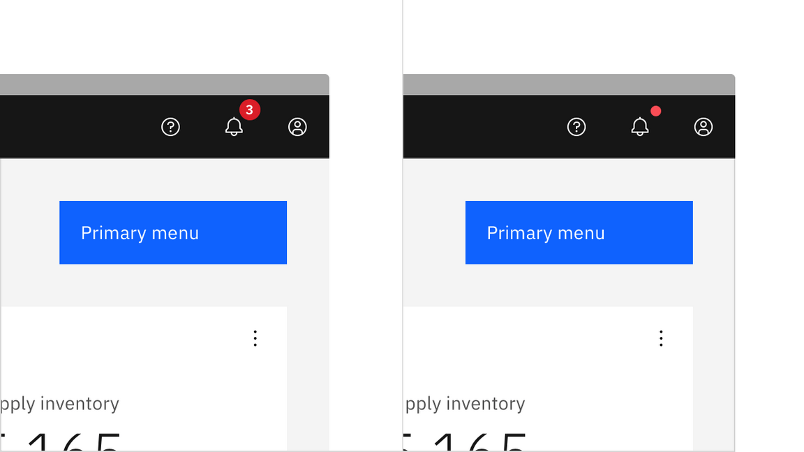
Badge statuses with numbers are usually used for global notifications.
Badge status with number
Numbers are used in conjunction with a badge status when a count of new or updated items is available and it’s important for the user to know the number of updates.
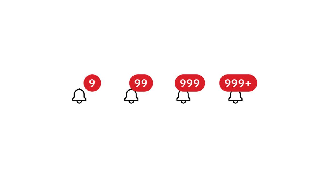
Badge status numbers can only be used in conjunction with the large icon button because with anything smaller, the icon gets covered. In very rare cases badge number may exceed two digits.
Badge status without number
A badge indicator with no number is used when a new notification is available and the number of notifications is either unknown or irrelevant to the user. The dot badge is less noticeable than the numbered badge, but still draws the user’s attention to the icon button.
Shape indicators
Shape indicators combine color shape and text to create a standard and consistent way to indicate the status of a device, feature, or version. Icons are not present. These shapes are also seen in certain diagrams and data visualizations, for example network diagrams.
The shapes are only the most basic geometries, derived from the larger icon containers, so they can be easily discerned at small sizes. Shape indicators are not available in outline because they are so small. The only situation in which you would use an outline is to ensure contrast accessibility for yellows.
The table below is a first pass at establishing a standard lexicon for symbol indicators within IBM product.
Used for: critical situations, emergencies urgent alerts
Used for: warnings, errors, failure, deprecation, cancellation
Used for: major caution, serious situations, critical instability
Used for: minor caution, prevention, instability
Used for: success, completion, stability, active states
Used for: experimental work, outliers
Used for: additional information, wild card
Used for: unfinished, running processes
Used for: unstarted tasks, drafts, disabled processes
Type pairing and alignment
Shape indicators are also ‘contextual’ status indicators. Like the status icons above, assets have been created for the shape indicators that take into account optical alignment. Do not attempt to create these shapes yourself. Use the approved shape indicator provided for you in the icon library.
As with the icons, choose the appropriate canvas size depending on the size of the status label with which it is paired. 16px symbols are optimized to feel balanced when paired with both 12px and 14px IBM Plex. Since shape indicators are most often reserved for small usage scenarios in product, we would advise you to use full status indicators with 16px IBM Plex.
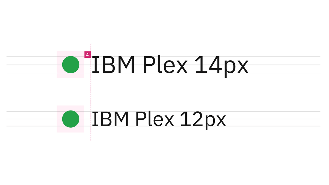
Shape status canvases should be placed 4px from the beginning of the text box.
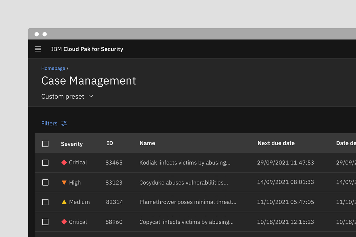
Example of the status label directly next to the shape
Legends
Because shape indicators don’t have the added recognition of an icon, it’s even more important that they are paired with a status label. Alternately, the designer can provide the user with a legend if a status label isn’t an option.
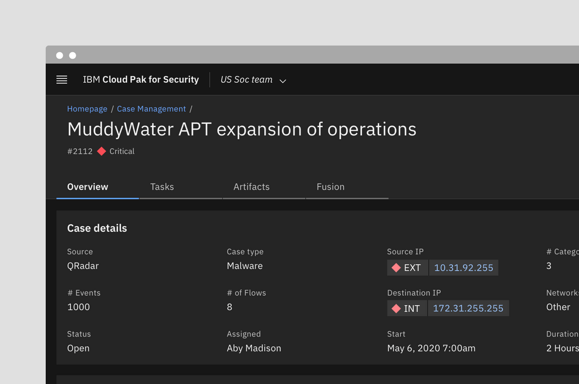
Example where the status symbol indicator depends on the legend at the top of the page
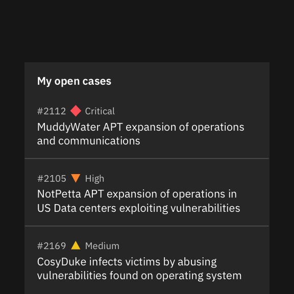
Do place shape indicators before labels; they can be placed after other text only if there is no character count variation.
Do not place shape indicators after the labels to avoid pushing them out of alignment.
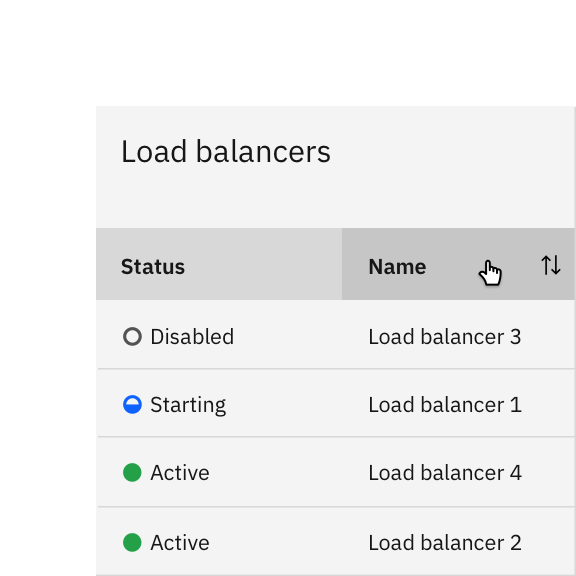
Do use shape, color, and status labels to improve scannability.
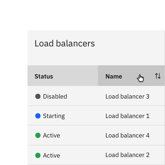
Avoid using only color and status labels to differentiate your content.
Differential indicators
Differential indicators often help users understand the movement or changes in information. They are especially useful when users are monitoring differences in large lists of statistics and anything other than type would be too obtrusive. Examples include the common convention of color-coding stock symbols in an investment account if their price has changed substantially. Designers also rely on them to highlight deltas in data visualizations.
Although typographic indicators can be used without an icon as long as a minus or a plus sign is used, they are most often paired with arrow or caret icons in our system.

Color
Differential indicators are either displaying a positive or a negative value. Color is optional in these situations as long as the value has either a ‘+’ or ‘-’ in front of it, a chevron icon, or an arrow icon. Unless the data involves temperature, positive values are represented by the green spectrum and negative values are represented by the red spectrum.
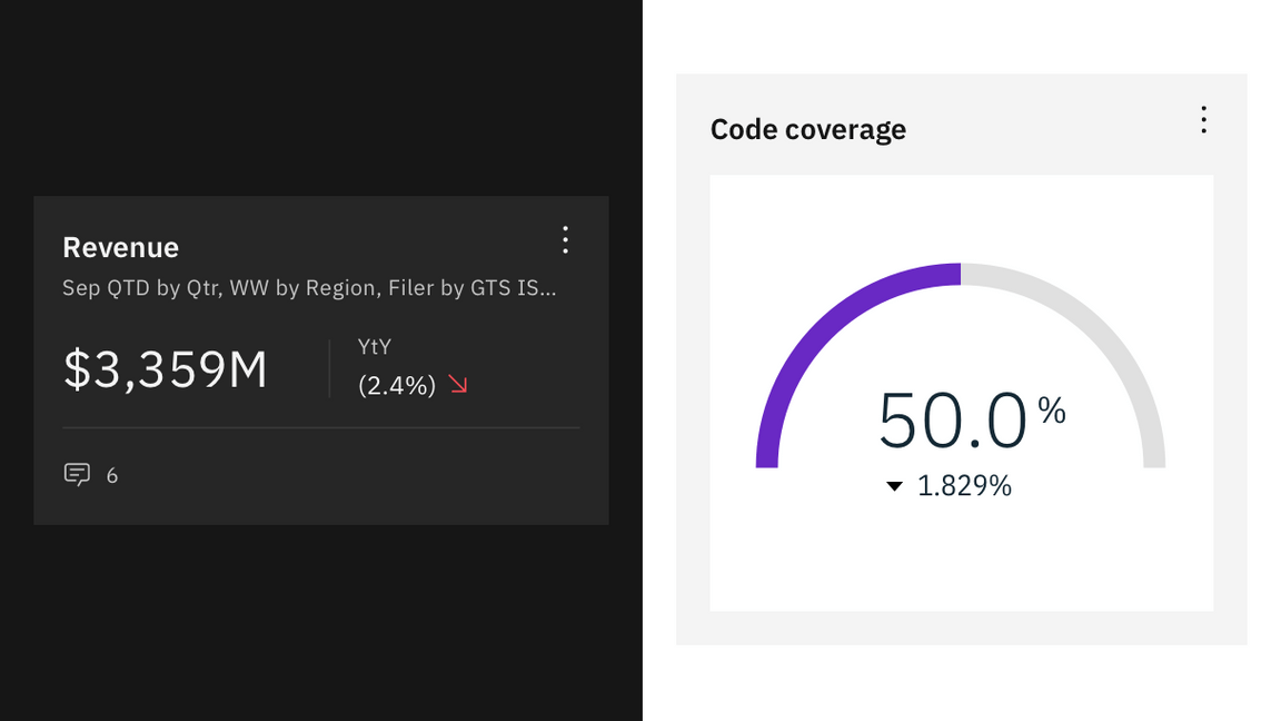
Differential indicators are most often seen in dashboards.
Accessibility
Accessible design not only helps users with disabilities, it provides better user experiences for everyone. The most common form of color blindness is red/green color blindness. The inability for some users to distinguish between red and green means that products cannot simply rely on color to show status. As a result, the status system relies on three key elements; color, shape, and symbol.
For example, the critical icon is not just “red”, it is the sum of the following elements.
Color = Red
Shape = Circle
Symbol = \
Text = Critical
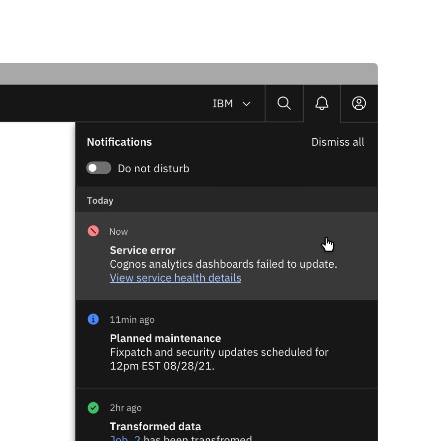
Do include at least three out of four indicators of status to meet accessibility requirements.
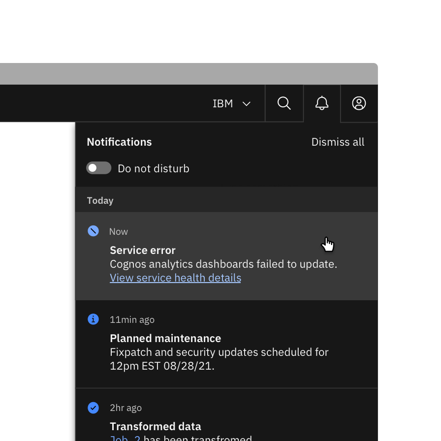
Avoid designs with less than three indicators of status; using solely color and symbols is inaccessible.
Status notifications
Don’t use notifications that dismiss on a timer for critical or emergency messages.
Some users with disabilities need more time to read or interact with messages and timed toasts may not provide sufficient time. WCAG 2.1 success criterion 2.2.4 (AAA)
Users should be able to manage or limit non-critical notifications.
This gives users the control to reduce the number of distractions or disruptions they receive, which is particularly helpful for users with cognitive limitations. WCAG 2.1 success criterion 2.2.3 (AAA)
Related
Components
Patterns
References
- Nick Babich, 4 Ways To Communicate the Visibility of System Status in UI, (UX Planet, 2020)
- Aurora Harley, Visibility of System Status (Usability Heuristic #1), (Nielsen Norman Group, 2018)
- Miklos Philips, A comprehensive guide to notification design, (UX Planet, 2020)
- Kim Salazar, Indicators, Validations, and Notifications: Pick the Correct Communication Option, (Nielsen Norman Group, 2015)
Feedback
Help us improve this pattern by providing feedback, asking questions, and leaving any other comments on GitHub.